Showing posts with label art supplies. Show all posts

Wednesday, January 14, 2015

How To Control Watercolor And Keep The Edges Soft

After I posted my watercolor "Blue Eyes" on Facebook, several people asked me a very good question. They were wondering how I managed to keep all the edges soft, as if I painted on wet paper, while achieving so much control, as if I painted on dry paper.


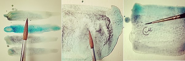
The truth is, the whole painting is based on one simple approach. Here's how it works. First, make the paper wet. Then wait until the surface is no longer glossy, but still damp and cool on touch. Next, apply the paint, varying the amount of pigment on the brush depending on your needs.
On the picture below, this approach is illustrated by the brush strokes in the middle. They are well defined, but a little bit diffused, which creates a nice and soft appearance. The brush strokes on the left were made when water was still sitting on the surface. The ones on the right were applied on completely dry paper.


In other words, all you need is catch the right moment, when the paper is not too wet and not too dry. This maybe not quite as easy as it sounds at first, but it certainly comes with practice.

Happy painting!

Friday, November 14, 2014

Walk With A Friend

It used to be my childhood dream to walk through the autumn leaves with a four-footed friend by my side. It's yet to come true, but maybe some dreams are better to stay that way so they always live in our hearts... and in paintings, of course.


Speaking of this watercolor, I'd like to mention my new W&N bamboo brush (Size 12) that came in handy here. I was attracted by its unusual look and, honestly, very cheap price:) Originally designed for Asian ink and watercolor painting, this brush is very helpful in making effortlessly expressive strokes. You can see them especially well in the top right corner of the painting. The only downside for me is that the brush doesn't have spring to it, since the bristles are very soft (look at the photo below). It also sheds a little bit. All in all, I found this brush worth trying out.

Thursday, October 9, 2014

Still Life With Grapes

One day I was staring at the white sheet of Hahnemuhle 280lb watercolor paper and had no idea of what to paint on it. So I opened the fridge and grabbed the first thing I saw, which happened to be a bunch of grapes. Then I added my favorite Marjolein Bastin mug and a lemon leftover, and - voila - I had a juicy still life.

Thursday, July 24, 2014

Cherry Turnovers

I've been meaning to try Hahnemuhle Leonardo watercolor paper for ages, but kept putting it off, because it wasn't available at my favorite art supply stores. So finally I ordered it on Amazon, and the paper came to me all the way from Europe. It was my first time painting on such a heavyweight (280lb) paper, and I totally loved it!


Showing you only one turnover, since I couldn't help but bite the half of a second one before I started painting it:) Also, this yummy watercolor is available on my Etsy shop.

Friday, July 11, 2014

Wet-on-wet watercolor tutorial

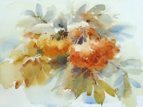
Hi everyone! I finally made my first tutorial, which demonstrates my typical workflow for wet-on-wet painting. This tutorial promotes spontaneous and expressive watercolor painting technique, without preliminary contour drawing. Hope you will find it useful and enjoy the process as much as I did!


Materials I used for this tutorial:

1. A block of Arches cold press 140lb 9x12 inches
2. Squirrel blend flat wash brush 3/4'' and sable pointed round brush size 4
3. Watercolors: Yellow Ochre, Quinacridone Gold, Light Red, Perylene Maroon, Cobalt Blue, French Ultramarine.

Wish I had some rowan branches here on my table, but unfortunately I'm gonna have to work from just a photograph.

Speaking of which, I recommend that you do not copy reference photos, but rather, do your personal interpretation of reality and show how it makes you feel. The camera documents all the details, but it's up to you to decide which of them are worth including in your painting. I love the quote by Charles Reid, one of my favorite watercolorists, "Painting is about illusion. A painting can't copy nature. You can't paint what you see. The details you see in a light flower can destroy the essence of a light flower. Are the details in the flower more important than the essence of the flower?"

To get you started, here are the key points of this tutorial:
  1. Keep it simple and paint from big to small, focusing on shape and value.
  2. Try to work as quickly as possible, making free and easy brushstrokes.
  3. All work should be done on wet or damp paper. If some spots happened to dry out completely before you finished, you may damp them using a wide soft brush and clean water. Be careful with the damping process, do it with one light stroke, and make sure not to blur anything.
  4. Limit your palette to achieve unity and color harmony.
Note: In making this tutorial, I assume that you are familiar with basics, such as color theory, aerial perspective and composition, and know what negative painting is.

Step 1. I take the flat brush and start with a light wash of Yellow Ochre.


Step 2. I paint the background leaves, using mixes of Ultramarine and Light Red for gray shades, or Ochre and Cobalt Blue for green shades. At this stage, I also outline the composition.

Step 3. I shape the rowan clusters, using Quinacridone Gold for a smaller one, and the mix of Ochre and Light Red for a bigger one. Note that the lightest spot of a bigger cluster is left untouched.

Step 4. Using the same flat brush, I continue to define the clusters and leaves. I don't overwork the surface but let the colors flow and mix on the paper.

Step 5. I work on the clusters, placing darker values, and paint leaves on the foreground using the mix of Quinacridone Yellow and Ultramarine. Btw, as you probably know, squinting your eyes from time to time during the work helps to see better definition of shape and value.

Step 6. I take a round brush and paint some leaf stalks using Ultramarine and Light Red.  Remember that the paper should be damp at this stage, so the stalks could blend in. Painting darks on dried paper would make them foreign.

Step 7. I start working on the foreground, by adding a few brushstrokes on the focal point (a right cluster of rowan berries). Note that I apply aerial perspective to this painting, which means that distant parts appear cooler due to the atmosphere between them and the viewer. This method helps to emphasize the closer objects and bring them forward, thus creating illusion of dimension in the painting.

Step 8. I add a few more detail to foreground leaves. The idea is not to overwork them.

Step 9. With quick brushstrokes, I paint thin branches, using mixes of Perylene Maroon, Ultramarine and Light Red.

Step 10. At the last stage, I do some negative painting in order to add structure to the focal point.

A few more touch ups here and there, and the painting is done!
If you have any questions, I will be glad to answer them in the comments section.

Saturday, June 21, 2014

My Favorite Art Materials: Watercolor Paper.

As I promised, my second post about art supplies is dedicated to watercolor paper that I like and use often. Actually, it is the most frequent question I get asked regarding my work, so here's my experience to add to yours. See also the first part, which was about watercolor brushes.


There are plenty of different brands and sorts of paper on the market, and it often gets confusing to figure out which one suits best for your needs. It takes practice and experience to know the behavior of a particular paper and predict the results you are going to get. So after some trial and error I found paper which I'm more than happy to paint on (it doesn't mean, however, that I stopped trying out new brands, since I always keep my mind open about art materials).

1. Arches cold press 140 lb is the paper I use probably 80 percent of the time. This paper suits my painting style perfectly, and I love the way it accepts lots of water and pigment, producing lovely results. As an illustration, here's my watercolor made in wet-on-wet technique, on a paper from 9''x12'' block. I prefer blocks over sheets btw, since they are so convenient to use - no need to cut and tape.


2. Sennelier grain torchon 140 lb is another sort of paper I've been using a lot lately for small illustrations like these butterflies. Personally, this paper is more accommodating for wet-on-dry rather than wet-on-wet watercolor technique. The surface has a very nice, "upscale" feel and texture to it, and the only downside of this paper is that it's pricey.


3. Saunders Waterford grain torchon 140 lb is also a great paper to work with. You can see its beautiful texture on my painting "Hand In Hand", which is sized 9''x12''. The paper has a pleasant, slightly creamy tone.


4. Fabriano Artistico cold press 140 lb is last, but not least. A not to miss paper, in my opinion, since it's versatile and receptive to all watercolor techniques. Therefore, I'm considering to use it more often. This is one of my latest works, painted on Fabriano paper. "Morning Coffee", 9''x12''.


Of course, the above is not a full list of papers I've had a chance to work with. It just would be impossible to tell about all of them in one post. I've painted on different media, from watercolor canvas to paper made of hemp and lokta, and I'm in a constant search for new textures to try. Apparently, it can be equally delightful to paint on either expensive, classic watercolor paper or some sorts that aren't even meant to be used with watercolor. There are no limits to creative ideas, after all.

In the comments section, I'd love to hear about your favorite paper. Have you ever tried anything unusual to paint on with watercolor?

PS Next time I will tell about my watercolor palette, so stay tuned!

Tuesday, December 24, 2013

Happy Holidays!

Dear friends, today I was thinking how blessed I am having the opportunity to express myself in art and to share my work with you. Whatever sources of inspiration I've ever had, the truth is: it's your kind words that inspire me most and keep me going. And your attention is the biggest reward for my efforts. When I see your visits on my blog from all over the world, it brightens up my day and fills my heart with warmth. Also, glad to have you following me on Facebook, Instagram and Pinterest. I'm amazed at how much credit you give me, and that's what motivates me to improve my skills.

So I'm saying a huge thanks to each of you, and wishing you always be happy and healthy. Have a very joyful holiday season!

Thursday, November 14, 2013

The Big Fall Post

Each year, as sweet autumn days go by, I feel like capturing all their beautiful moments in painting. As usual, most of my inspiration comes from what is around me, especially when the weather is so nice for hanging outside and collecting ideas.


The autumn sun bathes everything with a golden glow, and every single blade of grass seems a perfect creature. Take a look at this dog rose, for example. Don't you think it's begging to be painted?


Of course it is! I painted this 10''x8'' watercolor on Arches paper, using my special fall collection of colors. Although I usually prefer a limited palette, this time I couldn't help but use all 18 of them:) The painting was started wet on wet, in order for colors to blend, then some details were added as the paper was drying out.


My autumn palette includes warm reds, deep blues and natural, earthy browns. In case you wonder, here's the list:


Speaking of colors, here is another thing that brightens the season. Everything gets a cute pumpkin makeover this time of year:) What else pops into my head when I think about fall, is cinnamon gingerbread latte, woolen sweaters, warm apple cider, the aroma of freshly baked goodies, morning mists, rustling of leaves under the feet, dining with candles... Wouldn't it be wonderful to paint all of these and convey all those feelings?

And what are your favorite little things to enjoy in fall?

Wednesday, October 2, 2013

My Favorite Art Materials: Watercolor Brushes.

My lovely readers often ask me what materials I use, so I figured it was about time I made a series of posts on this topic. I do not claim to be the final authority on the subject of art supplies, and none of the companies mentioned have endorsed me. My sole intent is sharing some experience and knowledge, hope you find it useful:)

This very first post is all about brushes I use most. Let me start with a quote of renowned master watercolorist Charles Reid. In his book "Painting Flowers in Watercolor" he says:


Hard to disagree, isn't it? I only would like to mention that good brush can be a very broad definition, and it doesn't necessarily have to be super expensive. Even the old rough looking brush can sometimes do a wonderful job on certain objects, and feel just right in your hand.


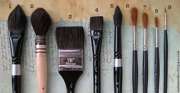
1. Silver Brush Black Velvet Oval Wash, Size 1'' is a blend of squirrel hair and synthetic filament. It's my "work horse" brush. What I like most about oval brush is that it provides a variety of strokes and somewhat combines features of two shapes: round and flat, depending on how much pressure I apply to it. I use this brush for both broad washes and some detail work.

2. Da Vinci Quill, Size 6, is just a big bold watercolor brush that holds an incredible amount of paint and water. Perfect for washes, as well as getting around details. I find this brush to be lacking of spring a little bit, but other than that, It works great for loose painting and gets used very often.

3. Silver Brush Black Velvet Wash, Size 1-1/2'' is another combination of squirrel hair and synthetic fibers. This flat brush is ideal for large washes and laying in water.


4. Silver Brush Black Velvet Square Wash, Size 3/4''. This medium-sized, squirrel blend flat brush doesn't get used very often, comparing to others, but comes in handy when I need to paint straight lines for example.

5. Silver Brush Black Velvet Round, Size 16. A full bodied, medium-sized round brush like this one is a must have for me, since it is very versatile and can do the trick for everything.

6. Winsor & Newton Artist Pointed Round, Size 8. I love this Kolinsky sable brush for its excellent carrying capacity and beautifully pointed tip, which makes it perfect for long, continuous strokes, some washes and detail work.


7. Winsor & Newton Artist Pointed Round, Size 7. Being just a little bit thinner, this brush does essentially the same as Size 8 version.

8. Winsor & Newton Artist Pointed Round, Size 4. I use this brush for painting smaller objects, fine detail and lines.

9. Roubloff (Russian brand), Size 1. My oldest and tiniest sable brush. No painting is done without its participation, since I use it for signing my watercolors.


In the comments section, I'd love you to share your thoughts and preferences regarding watercolor brushes. What are your "must haves"?

Tuesday, July 23, 2013

Floral Fusion

Update in my Etsy shop! This floral watercolor painting fits perfectly in standard mat with 8''x10'' opening. And yes, the gorgeous bouquet on photos is from the farmers' market:)


Tuesday, May 7, 2013

The Old Chapel

You might think this is an Italian scenery, but it's not:) Actually, I saw this cute chapel on the road leading to the winery in California. The place was surrounded by grape vineyard with blue hills on the background, and everything was bathing in the sunlight.


9''x12'' on Arches watercolor paper.

Monday, April 29, 2013

My Etsy Shop

I am very pleased to announce that I've finally opened up my Etsy shop!
You are more than welcome to check it out: http://www.etsy.com/shop/CMwatercolors

Please feel free to contact me with any questions about purchasing my artwork:)

Tuesday, April 23, 2013

Lemon Raspberry Muffin - sold

This muffin was not easy to paint, because its teasing smell kept interrupting my focus:)
10''x7'' on Arches watercolor paper


Lemon Raspberry Muffin
Original watercolor painting on a high quality 300 g/m - 140lb Acid Free Arches watercolor paper.
10''x7'' or 26x18 cm

SOLD

Tuesday, April 9, 2013

Tulips - sold

Being a watercolor paper lunatic, I was very excited to try Saunders Waterford brand. It is manufactured by St Cuthberts Mill, which has been in paper crafting business since 1700's, and is located in English county of Somerset, on the ancient land, covered with legends and mysteries related to King Arthur. Can you believe this?


As I unwrapped my brand new block of 140lb paper, I couldn't help but spend some time admiring its beautiful random surface texture. The paper has a pleasant slightly creamy color and very appealing look. I decided to paint something bright and springish on it, like tulips for example. To my pleasure, this paper handles the paint very well and doesn't fade as it dries. It also seems to be less prone to buckling (although I haven't tried wet-on-wet yet). Overall, I'm happy with this product and can't wait to continue experimenting with it.


Watercolor on paper 9x12 inches
SOLD