Hi everyone! I finally made my first tutorial, which demonstrates my typical workflow for wet-on-wet painting. This tutorial promotes spontaneous and expressive watercolor painting technique, without preliminary contour drawing. Hope you will find it useful and enjoy the process as much as I did!

Materials I used for this tutorial:
1. A block of Arches cold press 140lb 9x12 inches
2. Squirrel blend flat wash brush 3/4'' and sable pointed round brush size 4
3. Watercolors: Yellow Ochre, Quinacridone Gold, Light Red, Perylene Maroon, Cobalt Blue, French Ultramarine.
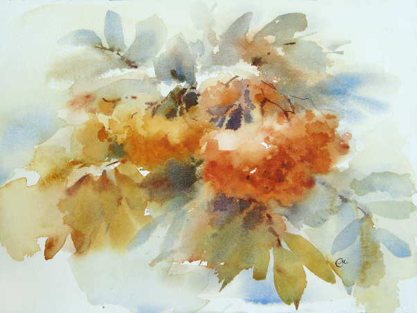
Wish I had some rowan branches here on my table, but unfortunately I'm gonna have to work from just a photograph.

Speaking of which, I recommend that you do not copy reference photos, but rather, do your personal interpretation of reality and show how it makes you feel. The camera documents all the details, but it's up to you to decide which of them are worth including in your painting. I love the quote by Charles Reid, one of my favorite watercolorists, "Painting is about illusion. A painting can't copy nature. You can't paint what you see. The details you see in a light flower can destroy the essence of a light flower. Are the details in the flower more important than the essence of the flower?"
To get you started, here are the key points of this tutorial:
- Keep it simple and paint from big to small, focusing on shape and value.
- Try to work as quickly as possible, making free and easy brushstrokes.
- All work should be done on wet or damp paper. If some spots happened to dry out completely before you finished, you may damp them using a wide soft brush and clean water. Be careful with the damping process, do it with one light stroke, and make sure not to blur anything.
- Limit your palette to achieve unity and color harmony.
Note: In making this tutorial, I assume that you are familiar with basics, such as color theory, aerial perspective and composition, and know what negative painting is.
Step 1. I take the flat brush and start with a light wash of Yellow Ochre.
 Step 2.
 I paint the background leaves, using mixes of Ultramarine and Light Red for gray shades, or Ochre and Cobalt Blue for green shades. At this stage, I also outline the composition.
 Step 3.
 I shape the rowan clusters, using Quinacridone Gold for a smaller one, and the mix of Ochre and Light Red for a bigger one. Note that the lightest spot of a bigger cluster is left untouched.
 Step 4.
 Using the same flat brush, I continue to define the clusters and leaves. I don't overwork the surface but let the colors flow and mix on the paper.
 Step 5.
 I work on the clusters, placing darker values, and paint leaves on the foreground using the mix of Quinacridone Yellow and Ultramarine. Btw, as you probably know, squinting your eyes from time to time during the work helps to see better definition of shape and value.
 Step 6.
 I take a round brush and paint some leaf stalks using Ultramarine and Light Red. Remember that the paper should be damp at this stage, so the stalks could blend in. Painting darks on dried paper would make them foreign.
 Step 7.
 I start working on the foreground, by adding a few brushstrokes on the focal point (a right cluster of rowan berries). Note that I apply aerial perspective to this painting, which means that distant parts appear cooler due to the atmosphere between them and the viewer. This method helps to emphasize the closer objects and bring them forward, thus creating illusion of dimension in the painting.
 Step 8.
 I add a few more detail to foreground leaves. The idea is not to overwork them.
 Step 9.
 With quick brushstrokes, I paint thin branches, using mixes of Perylene Maroon, Ultramarine and Light Red.
 Step 10.
 At the last stage, I do some negative painting in order to add structure to the focal point.

A few more touch ups here and there, and the painting is done!
If you have any questions, I will be glad to answer them in the comments section.